Plotly 格式化轴和刻度
你可以通过指定线宽和颜色来配置每个轴的外观。也可以定义网格宽度和网格颜色。让我们在本章中详细了解相同的内容。
用轴和刻度绘图
在 Layout 对象的属性中,设置 显示标签 为 true 将启用刻度。 tickfont 属性是一个 dict 对象,指定字体名称、大小、颜色等。tickmode 属性可以有两个可能的值——线性和数组。如果是线性的,则起始刻度的位置由下式确定 tick0 并在刻度之间步进 dtick 特性。
If tickmode 设置为数组,你必须提供值和标签列表 tickval and ticktext 特性。
布局对象也有 指数格式 属性设置为 ‘e’ 将导致刻度值以科学计数法显示。你还需要设置 显示指数 财产 ‘all’ .
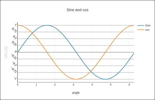
我们现在格式化上面例子中的 Layout 对象来配置 x 和 y axis 通过指定线条、网格和标题字体属性以及刻度模式、值和字体。
layout = go.Layout(
    title = "Sine and cos",
    xaxis = dict(
        title = 'angle',
        showgrid = True,
        zeroline = True,
        showline = True,
        showticklabels = True,
        gridwidth = 1
    ),
    yaxis = dict(
        showgrid = True,
        zeroline = True,
        showline = True,
        gridcolor = '#bdbdbd',
        gridwidth = 2,
        zerolinecolor = '#969696',
        zerolinewidth = 2,
        linecolor = '#636363',
        linewidth = 2,
        title = 'VALUE',
        titlefont = dict(
            family = 'Arial, sans-serif',
            size = 18,
            color = 'lightgrey'
        ),
        showticklabels = True,
        tickangle = 45,
        tickfont = dict(
        family = 'Old Standard TT, serif',
        size = 14,
        color = 'black'
        ),
        tickmode = 'linear',
        tick0 = 0.0,
        dtick = 0.25
    )
)
多轴绘图
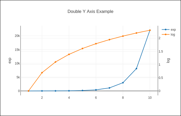
有时双 x 很有用 或 y 轴 在图中;例如,将具有不同单位的曲线绘制在一起时。 Matplotlib 通过 twinx and twiny 功能。在下面的例子中,Plotly 有 双y轴 ,一个显示 exp(x) 和其他展示 log(x)
x = np.arange(1,11)
y1 = np.exp(x)
y2 = np.log(x)
trace1 = go.Scatter(
    x = x,
    y = y1,
    name = 'exp'
)
trace2 = go.Scatter(
    x = x,
    y = y2,
    name = 'log',
    yaxis = 'y2'
)
data = [trace1, trace2]
layout = go.Layout(
    title = 'Double Y Axis 例子',
    yaxis = dict(
        title = 'exp',zeroline=True,
        showline = True
    ),
    yaxis2 = dict(
        title = 'log',
        zeroline = True,
        showline = True,
        overlaying = 'y',
        side = 'right'
    )
)
fig = go.Figure(data=data, layout=layout)
iplot(fig)
这里,额外的 y 轴配置为 yaxis2 并出现在右侧,有 ‘log’ 如题。结果图如下: