Matplotlib 直方图
直方图是数值数据分布的准确表示,是对连续变量概率分布的估计,是条形图的一种。
要构建直方图,请按照以下步骤操作:
Bin值的范围;
将整个值范围划分为一系列区间;
计算每个区间有多少个值。
bin 通常指定为变量的连续、非重叠区间。
使用matplotlib.pyplot.hist()函数绘制直方图,它计算并绘制 x 的直方图。
参数
下表列出了直方图的参数:
| x | 数组或数组序列 |
| bins | integer or sequence or ‘auto’, optional |
| 可选参数 | |
| range | bin 的下限和上限范围。 |
| density | 如果为 True,则返回元组的第一个元素将是归一化以形成概率密度的计数 |
| cumulative | 如果为 True,则计算直方图,其中每个 bin 给出该 bin 中的计数加上较小值的所有 bin。 |
| histtype | 要绘制的直方图类型。默认为‘bar’
|
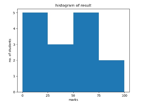
以下示例绘制了学生在班级中获得的分数的直方图,定义了四个 bin,0-25、26-50、51-75 和 76-100,直方图显示落在此范围内的学生人数。
from matplotlib import pyplot as plt
import numpy as np
fig,ax = plt.subplots(1,1)
a = np.array([22,87,5,43,56,73,55,54,11,20,51,5,79,31,27])
ax.hist(a, bins = [0,25,50,75,100])
ax.set_title("histogram of result")
ax.set_xticks([0,25,50,75,100])
ax.set_xlabel('marks')
ax.set_ylabel('no. of students')
plt.show()
出现的情节如下图: