R 正态分布
在从独立来源随机收集的数据中,通常观察到数据的分布是正态的。这意味着,在绘制横轴为变量值和纵轴为计数值的图表时,我们会得到一条钟形曲线。曲线的中心代表数据集的平均值。在图中,50% 的值位于平均值的左侧,而另外 50% 的值位于图的右侧。这在统计学中称为正态分布。
R 有四个内置函数来生成正态分布。它们如下所述。
dnorm(x, mean, sd)
pnorm(x, mean, sd)
qnorm(p, mean, sd)
rnorm(n, mean, sd)
以下是上述函数中使用的参数说明:
-
x 是一个数字向量。
-
p 是概率向量。
-
n 是观察次数(样本大小)。
-
mean 是样本数据的平均值。它的默认值为零。
-
sd 是标准差。它的默认值为 1。
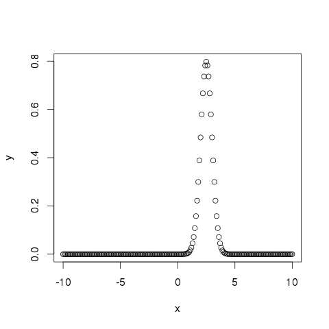
dnorm()
该函数给出给定均值和标准差的每个点的概率分布高度。
# Create a sequence of numbers between -10 and 10 incrementing by 0.1.
x <- seq(-10, 10, by = .1)

# Choose the mean as 2.5 and standard deviation as 0.5.
y <- dnorm(x, mean = 2.5, sd = 0.5)

# Give the chart file a name.
png(file = "dnorm.png")

plot(x,y)

# Save the file.
dev.off()
当我们执行上面的代码时,会产生如下结果:
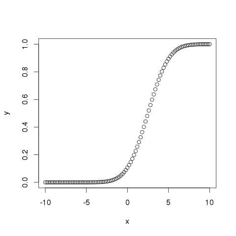
pnorm()
这个函数给出了一个正态分布的随机数的概率小于给定数的值。它也被称为“累积分布函数”。
# Create a sequence of numbers between -10 and 10 incrementing by 0.2.
x <- seq(-10,10,by = .2)

# Choose the mean as 2.5 and standard deviation as 2.
y <- pnorm(x, mean = 2.5, sd = 2)

# Give the chart file a name.
png(file = "pnorm.png")

# Plot the graph.
plot(x,y)

# Save the file.
dev.off()
当我们执行上面的代码时,会产生如下结果:
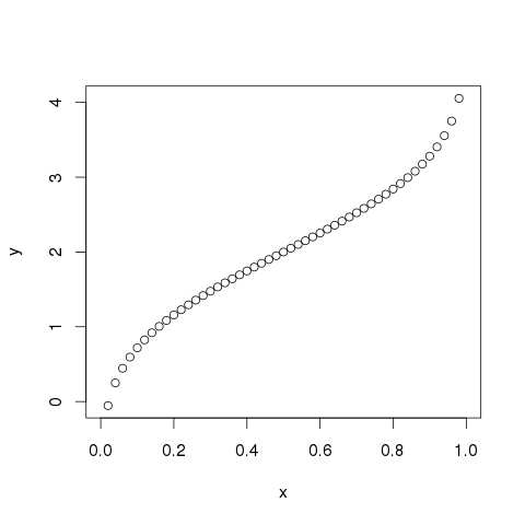
qnorm()
该函数取概率值并给出一个累积值与概率值匹配的数字。
# Create a sequence of probability values incrementing by 0.02.
x <- seq(0, 1, by = 0.02)

# Choose the mean as 2 and standard deviation as 3.
y <- qnorm(x, mean = 2, sd = 1)

# Give the chart file a name.
png(file = "qnorm.png")

# Plot the graph.
plot(x,y)

# Save the file.
dev.off()
当我们执行上面的代码时,会产生如下结果:
rnorm()
该函数用于生成正态分布的随机数。它将样本大小作为输入并生成那么多随机数。我们绘制直方图来显示生成数字的分布。
# Create a sample of 50 numbers which are normally distributed.
y <- rnorm(50)

# Give the chart file a name.
png(file = "rnorm.png")

# Plot the histogram for this sample.
hist(y, main = "Normal DIstribution")

# Save the file.
dev.off()
当我们执行上面的代码时,会产生如下结果:
